A logo is a succinct and visual way of communicating your business’ unique philosophy, identity, and style to your clients. Since all the modern branding principles use logo as their strategic foundation, it becomes ever more important to get the design of the logo absolutely right. For real estate firms, one of the most highly competitive businesses in the country, this importance is crucial.
When it comes to real estate logo designs, one of the most basic choices you’ll have to make about the architecture of the design is whether to create a classic design or opt for a modern look. Helping you arrive at the correct answer are three simple questions:
- As a business, who you are at your core, your unique characteristics?
- Who is your target market?
- What locations do you mostly deal in? Or want to expand to (if it’s a rebrand you’re after)?
Answers to these questions will help you select your design theme and tell you whether you should go for a classic design or a modern feel. To aid you further, we are going to list down some of the most prominent styles of each of these two design philosophies plus examples. You can use them as your inspirations, a mood board, or just choose one for your firm if you like.
Let’s start with the modern design first.
Modern Real Estate Logos:
Modern design is all about lines, angles, cleanliness, and minimalism. They are more technology centered, have polished looks, fewer elements, and lots of white space. If your prime real estate clients are young first-time buyers, up-and-coming entrepreneurs, or millennials looking into investment opportunities, you should definitely go for a modern logo.
Some of the most famous modern design trends are:
1. Line Art
Modern design aesthetics are characterized by the use of clean and simple lines. Line Art allows the design to have a polished look and a very neat feel. It usually employs the use of a single line that’s unbroken, and which moves across the canvas encasing a design within its boundaries.
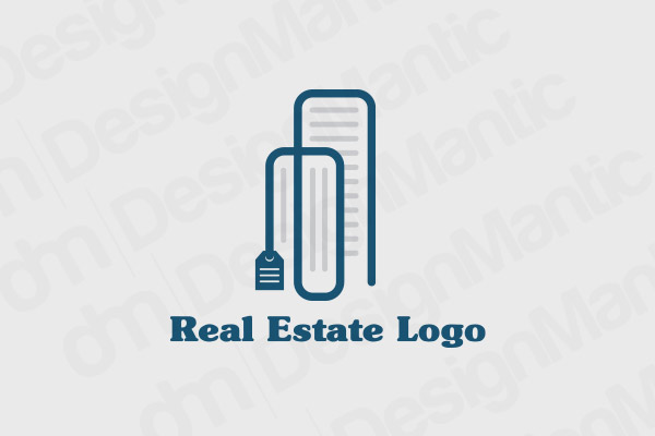
Line art logo depicting a commercial building
Or you can use more than one line and still produce a neat and beautiful design.
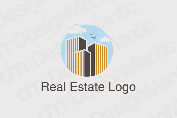
Line art in building logo for real estate
2. Negative Space
Negative space is a design concept that utilizes all the available white space around the design and makes a part of it. Designs that use negative space become quite flexible and responsive, as they can be transferred to multiple surfaces and canvases without disrupting any of their elements.
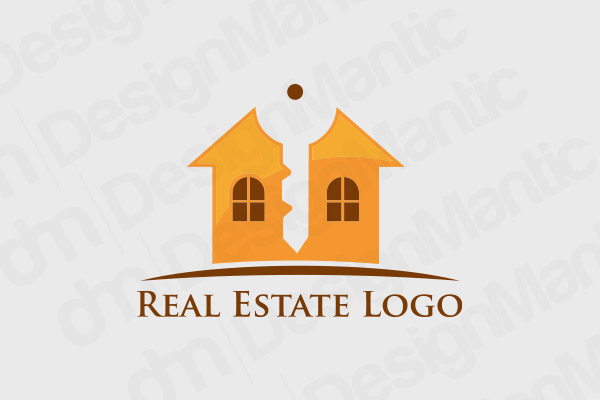
House logo with key in the negative space
3. Minimal
Though minimalism is considered a form of modern art, it actually has its roots very deeply into history. Ancient religion of Buddhism, for example, practices the art of life where less is truly considered more. Similarly, the ancient culture of Japan that appeals to the modern day is a lifestyle, décor, and architecture of simplicity, necessity and minimalism.
Minimal design concepts depend only a couple of elements to complete the design. There’s usually a lot of white space in minimal design, a few relevant color choices for the real estate logos so as to keep the palette simple, and only the most necessary elements added in the mix.
For example, in these construction logo designs you can see how the white space is giving an almost 3-d effect to a very simple, minimal multi-story building icon. In the next example, the silhouette of the building has been created using upward moving arrows with three colors used in harmony.
Minimal real estate logo in teal color using white space
House silouhette logo with arrows.
4. Abstract
At first glance, abstract design may look un-patterned and vague but it creates coherence from the chaos that is seemingly on the surface. Abstract design logos have a lot of geometric shapes going on, lot of symmetrical patters, or asymmetrical line art. All these elements make abstract design a perfect choice for logo art. For application and inspiration, take a look at these logos:
Abstract real estate logo in brick design
Abstract logo in geometric design
5. 3-D
Designs that let you experience all three dimensions of an image are called 3D designs. With the Internet cram packed with flat and material design images, a 3D logo can be a great way to stand out. 3D real estate logos are creative ways to highlight details in the logos and to make other points into focus.
Blue 3D Model Logo
3D real estate logo in cubes
Classic Real Estate Logos
Choosing a classic real estate logo, you are relying on the enduring characteristics that a classic design has to offer. The characteristics that will be timeless and help you launch or prelaunch yourself in the market with a sense of authority and experience.
On surface, classic real estate logo elements may look too easy to some. A slanted roof, windows, keys and such. However, by creatively incorporating these classical elements in a clean and polished design concept, you can produce a logo that can have the best of both the worlds.
Here, we are going to take a look at some of the iconic symbology that classic logo designs can offer for the real estate market.
1. Skylines
Skylines are perhaps the most popular staple of real estate logos, and rightly so. They are easily recognizable to the locals, and have even more appeal if you operate in a big city and want to attract out-of-states investments.
Real estate logo with skylines
Real estate logo depicting city skyline with a sunset
2. Scenery
A picturesque scenery, sun, and homes are few other classical elements popularly associated with real estate logos. Since they project a feeling of family, security, and happiness, they are highly suitable for a real estate firm selling to first-time buyers.
Colorful real estate logo with beautiful scenery
3. Keys
Another classic logo icon that will never go out of style for the real estate market. Key is a highly symbolic image and conveys the feelings of opportunity, accessibility, and invitation.
Classic real estate logos using key symbol
Key house logo in grey color
4. Retro
A vintage logo is perfect for a real estate business that sells old mansions, art deco apartments, classic brownstones, or other vintage properties. If you want to appeal to the customer base with a very specific look and feel of the house in mind, a retro logo is the just the thing for you.
Classic house design for logo
Related: How To Use Golden Ratio To Design A Balanced Residential Real Estate Logo?
5. Bold Letters
Classic design is all about making your presence known in a prominent way and with abundance. Keeping this in mind, real estate logos with bold, prominent lettering or typography are a great choice. The letters can stand alone or can accompany a real estate symbol discussed earlier in the list.
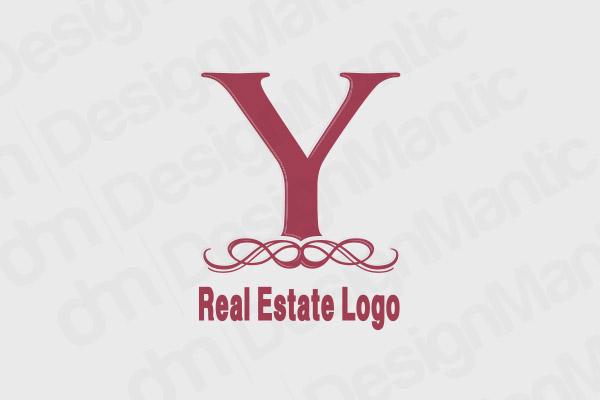
Bold lettering as the logo design
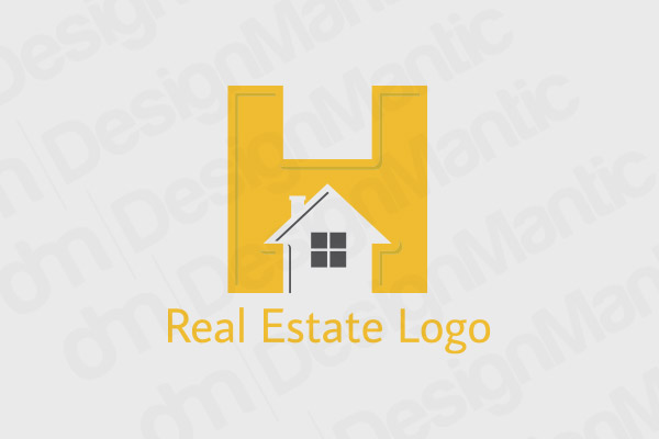
H letter logo for real estate
The Verdict
After discussing different styles between each of the two main design philosophies, it is actually interesting to note that the comparison between the two is more cosmetic than not. Each of these two design concepts serve two very different design and marketing needs, so which one you choose depends less on their comparative differences and more on your specific business goals.
Try Our Personalized Logo Maker:

