Gaming logos are unlike any other industry logos. Where logos in most sectors are generally used as communication devices — tell people what the brand is, what it does, convey a set of emotions, and be memorable — gaming logos have more jobs to perform.
More than anything, a gaming logo needs to be visceral, action-packed. It has to have thrill, buzz, and candor. It has to electrify you, entice you, and compel you to start playing.
To achieve this sense of high-energy and urgency, designers use a lot of high-contrast colors, vivid icons, and jagged, charged typography. But these elements on their own aren’t enough. To elevate the design, details are used. Lots and lots of details. Think of the Fortnite logo, for example.
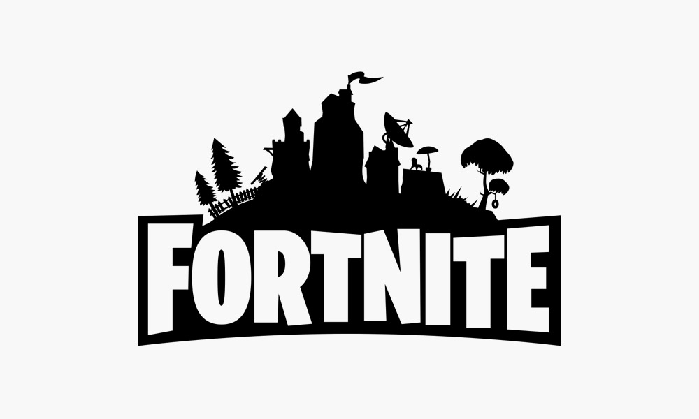
Image Source: SeekLogo
It has that swirling banner atop the castle, the slightly tilting umbrella stand, and even that tiny tire-swing hanging from the tree. These details in the Fortnite logo help us vision a rich world of many characters and many stories. The Fortnite logo makes the game look sprawling and elaborate. Take away the details and it is just another type-based logo with nothing much to show for it.
Image Source: Wikimedia
To avoid such a barren identity for your gaming logo, buff it up with rich, plentiful details.
Tips To Create A Richly-Detailed Gaming Logo
To keep the god of details on your side, here are 5 prayers (or design tricks) to perfect!
1. Focus On The Main Concept
In the beginning, focusing on details will get you off-track. To stay on the path, start with fleshing out your main idea. Draw it on the paper or on your tablet to see how it looks. Work on the layout, balance, and highlighting or diffusing any parts that you see fit.,
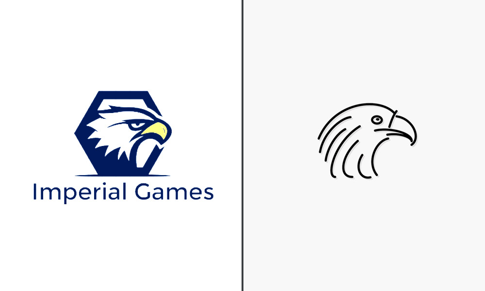
Image Source: Wikimedia
For example, if you are creating an animal icon for your gaming logo, let the animal take shape before you fine tune its features. Once you see the icon in line art, you’ll have a much clearer idea on how to proceed.
2. Adjust The Line Thickness
Transfer your sketched games logo on your Illustrator to give it the vectorized form to start the main work.
Still in its line art form, look at your animal icon, and see what you want to do with the line thickness. The outer lines will need to be stronger and thicker than the rest, for sure, but you’ll need to try a few options for the inner structure to see what works.
Play around with a few width options. The areas you want to highlight or the ones that you want to hide in the background, plus spaces where the design will be darker/lighter than the rest, all of that will be solidified in this phase.
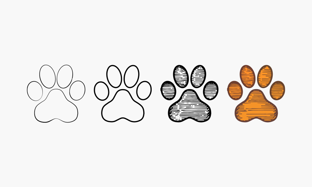
Image Source: Freepik.com
Stating the obvious, areas that you want to highlight or where the design would be heavily shadowed need to have thicker lines than the rest. Consider this the first step where you are laying the groundwork for future detailing. Do good work here so you don’t have to keep coming back to this step over and over again. That will just weaken the concept and make the design look spindly and confused.
3. Apply High Contrast Colors
To highlight your details, nothing works as effectively as high contrast. Now, there are a few ways to achieve good contrast in logos, but colors are one of the most influential elements to take advantage of.
High contrast colors charge up the dopamine in our brain and fill us with energy and buzz. Pairing cutesy pictures with eclectic color combinations, you can achieve a high-impact look for your gaming logo without much effort.
But, of course, effort is important if you want to create a gaming logo that’s memorable. So, choose your game logo colors with care. Separate your design’s dark and light parts and see how you want to combine colors there.
Image Source: DesignMantic.com
Color pairing tools like Coolors are a great way to get the juices flowing. Explore palettes and combinations to see which colors offer the best contrast to your gaming logo. Remember, your goal is to make the logo come alive on the screen, so only choose colors that are up to the task.
4. Choose Fonts Based On The Game’s Genre
Fonts are some of the toughest key decision-makers in logo designing. No matter how breathtaking your visual, if the font doesn’t correlate to that, you’re doomed. But fonts are trickier to get right than colors, so here’s a simple tip to follow when choosing fonts for your gaming logo: look at the game’s genre.
Image Source: DesignMantic.com
Image Source: DesignMantic.com
Horror, sci-fi, and adventure games benefit from Serif fonts with drooping or jagged edges, depending on the kind of emotion you’re going for. Games that are rooted in futuristic, tech themes should go for Megrim or such to convey a digital world. Children-centric games, no matter the genres, should favor fonts with easy and fun-looking fonts with rounded edges and squishy curves, especially if your game targets younger children.
5. Add Shadows And Highlights
This step deals with finishing touches. You will darken some corners and lighten the others to make your gaming logo look fierce, aloof, and sleek in turns.You can also play with the highlights to make the game logos look adorable, fun, and easy going, like the Discord logo for example.

Image Source: 1000logos.net
Shadowing will create depth in design. It can make a lion’s mane look deeper and thus the entire design more powerful. It can also make a logo look weathered, giving it a well-worn look that’s ideal for world-building games that are set in ancient times.
Image Source: DesignMantic.com
Whatever your end game is, this is where it comes alive. Make the design eye-catching, evocative, and highlight details to make the games logos have memorable identifiers.
Conclusion
The gaming industry is a battlefield of emotionally-charged brand symbols. Whether you are creating a gaming mascot or a single player simulation game logo, details are what make these logos stand out and claim a unique place in fans’ minds.
But for details to shine, it’s important the context and the groundwork is laid with strong foundations. I hope the tips we have shared in this article help you achieve that so you can incorporate features and additions in your gaming logo to make the design an absolute smashing hit.

