Fashions are cyclical, and graphics isn't exempted. The minimalist movement for company images, logos, and animations is circling back with more organizations sporting two-tone and two-dimensional logos than ever before. But, to master the art of 'simple but effective', you'll need to understand one of the fundamental aspects of design - contrast. And, furthermore, how to use it to your advantage.
When we think of contrast, our minds may leap to color. Light and dark. Black and white. But, contrast is defined simply as the difference between two elements. Now, every graphic designer and their mother knows that good designs seamlessly blend a number of elements together, utilizing shapes, colors, photographs, illustrations, typography, and lots of other subtle nuances to create a balanced design. And while contrast is important for all of those things it's perhaps most prevalent in terms of color, so that’s where we’ll start.
Attractive colors can be good for a design, but selecting colors them with a focus in mind is always better. Colors can be similar, or different, depending on purpose, but so long as their selected with an intention in mind, you should be good. Still, it's important to bear in mind the basics, like the color wheel for example, which tells you what colors complement each other, as well as what colors are polar opposites.
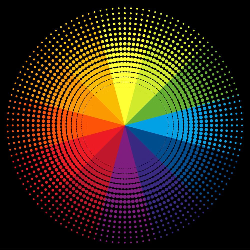
Image Source: iStock.com/designalldone
Because color is so quickly recognized, the adept designer will always consider not only what colors look pleasing to the eye, but the connotations that go with them too. Choosing the right color, along with the correct secondary colors can make a design really stand out. Using a highly contrasting color palette for background and foreground elements can be really useful for creating a bold design. But, by utilizing the color wheel and finding a good middle ground, you can create mid-ground images or outlines in a color that will either bring the foreground and background elements together, or separate them further. Make sure all of your colors are cohesive, and experiment with the flatness of tone.
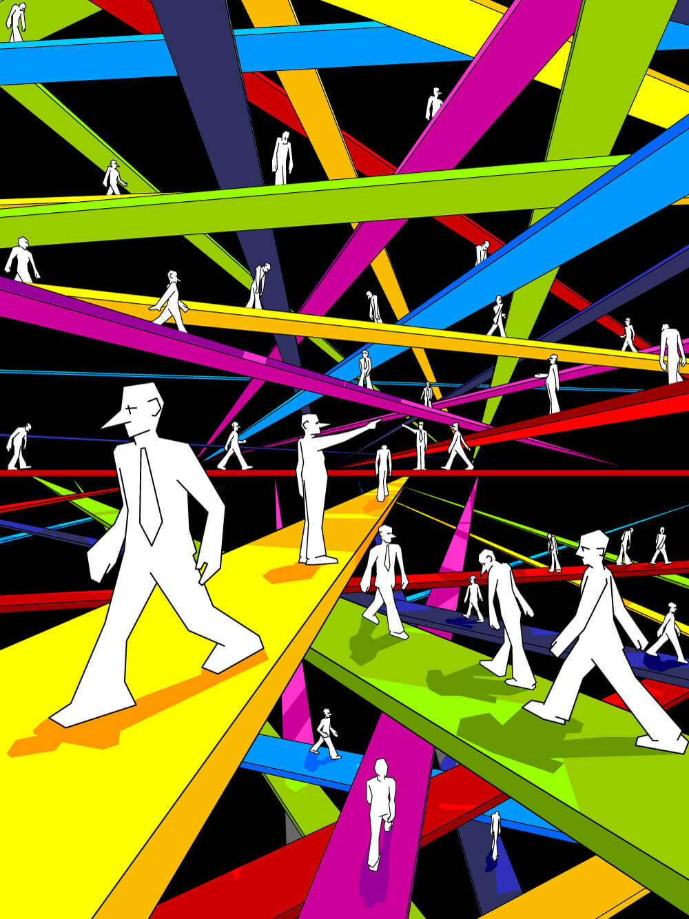
Image Source: iStock.com/valigursky
When you're working with different hues of a specific color, for a themed design - say blues for a nautical design, or reds for Valentine's Day illustration, work within tonal ranges too, by reducing the severity of that color. Using a flattened color scheme for background or foreground elements can really bring out, or tone down the impact of a part of your designs. Always remember that contrast means difference, but not necessarily opposite.
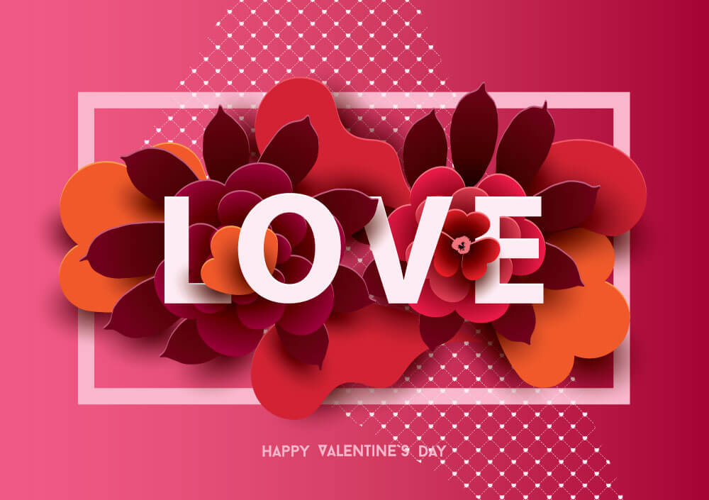
Image Source: iStock.com/Juicy_Bloom
Because of the way that the human eye works, we see shapes right after colors. Our brains work to understand and process what we see, and because it has a knack for shape recognition (that's what letters and numbers are - shapes, and we read by recognizing and interpreting them really quickly), any designer with a good eye will make shape and size work to their advantage.
In any design, contrasting shapes and sizes tell the eye where to look. Big elements are important, small elements not so much. Usually, the focus of our designs are the large, central things - and the cursory elements are there to improve the aesthetics, add contextual value, or to accomplish some other secondary objective.
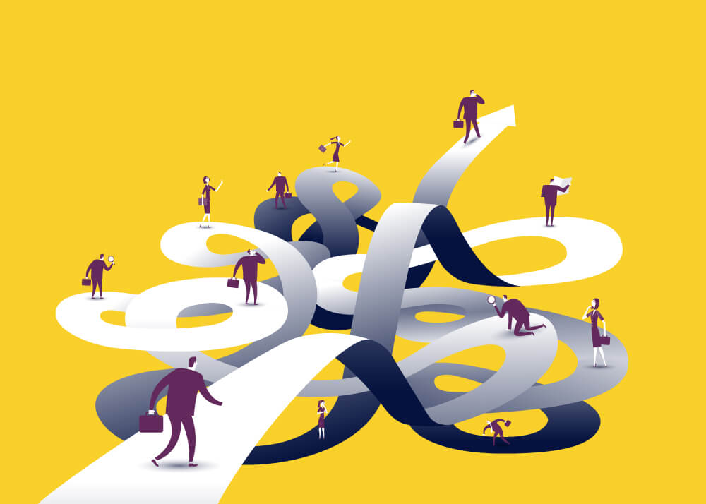
Image Source: iStock.com/akindo
There's also this unspoken need for ebbs and flows in design. It's the law of nature that there's give and take, push and pull, up and down. We breathe in oxygen and let out carbon dioxide. The tide comes in, and goes out. The sun sets and the moon rises. Design is not exempt. For there to be large, dominating elements, there needs to be smaller, bite size things to give the design balance. If everything's small, it makes the design feel really cluttered and scatterbrained. If everything's large, it either makes it feel crowded, or sparse.
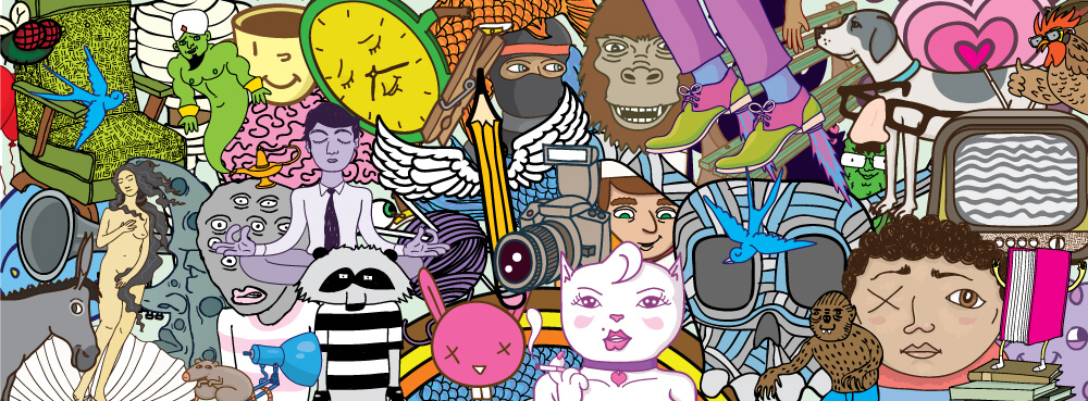
Image Source: iStock.com/Jayesh
In the image above, despite it being interesting to look at, there's a distinct lack of size contrast. As such, the eye doesn't know where to go, and gets lost in the design. We can't figure out what we're supposed to be looking at, which is a bad thing, if you're designing something for a client who wants to convey a message. But, with this image:
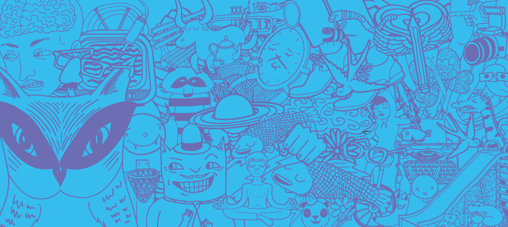
Image Source: iStock.com/Jayesh
Again, we get the snap reaction that it's a really interesting piece to look at, but with the application of contrast in size and shape, we go straight to the masked owl graphic. These similar design styles illustrate just how easily the eye can be guided by contrast in size and shape. The sharp, straight lines provide relief from the busy background, and our eyes settle there as an oasis from the visual onslaught everywhere else. Size and shape can be used to great advantage if they're applied carefully.
There are lots of different design styles that artists can choose from, and any good artist or designer will have both knowledge and mastery over more than one. Much like size and shape, and color contrast, too, the blending of style and influence can create a really visually interesting, and bold design. The token colors and shapes of well-defined styles can be manipulated to create contrasting effects, drawing the eye to specific elements, or creating a message that speaks on more than one level.
This super-interesting design blends late-modern and international design styles with a super-bold color palette to intentionally confuse the eye. The highly contrasted elements on the right create a busy and cluttered effect, which forces our eye to drift left, to the focus of the image, the Mars Rover. This image displays how design style and convention can be used to create focus in an image.
This interesting design that featured in a magazine utilizes two styles - namely the minimalist modern design style that relies on sharp edges, highly contrasted, flat colors, and simple design that create impact and control focus, blended with an interesting hand-shaded, more freeform style that's accented with gradients. The face of the man pictured becomes the focus, because the detail and intentional imperfection of it is more interesting to the eye than the perfectly drawn background, shirt, and bandana. This image shows how a digital image can integrate hand-drawn elements to create focus through contrast; which brings us nicely onto our next point.
Pairing contrasting fonts and typefaces, along with size and shape differences, and of course, carefully selected color palettes, can make any design stand out from the rest. A run of designs featuring Canadian cities gained popularity due to their interesting design style. They utilize an art deco style, along with flatter color palettes that rely on gradients to blend the colors together. But, because of the expert under-selling of the other elements, the text is able to shine through.
Perfectly positioned at the bottom, the driving lines of the mountains and the cable-car guide the eye to it. The subheading ‘Good Morning' acts as a secondary draw. This simple, yet effective contrast allows the eye to go exactly where it needs to - the name of the city, without the word itself overpowering the design. The lack of contrast in the mountain colors, along with the complementary palette that encompasses the rest, makes sure that our eyes go exactly where they need to.
Again here, the bright lines at the top, not gradient enough to hold our focus for too long, draw our eyes to the bottom, where a simply blue-on-blue low-contrast color scheme brings us once again to the focus of the image.
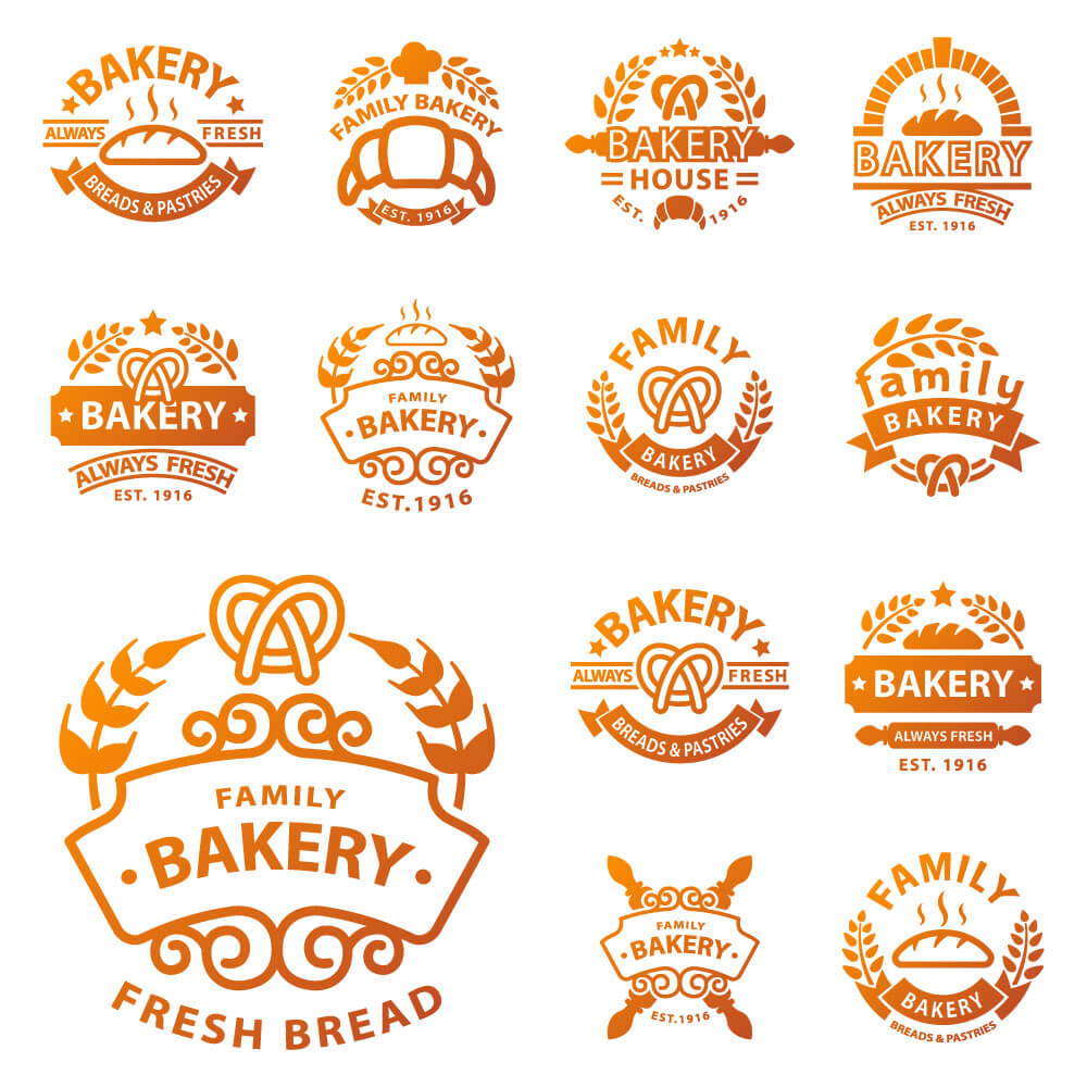
Image Source: iStock.com/ShowVectorStudio
This set of example logos for bakeries perfectly exhibits, outside of the art deco style, how typographic contrast can aid a design. By blending bold and soft fonts and different typefaces, the eye can be drawn specifically to the most important word of the design, whether it's at the top, on the left, or not.
Creating depth and shadow in your work may not be something that a lot of clients want for a logo, but these images display how easily a simply gradient, or color overlaid and offset layer duplicate can create a deep and bold image.
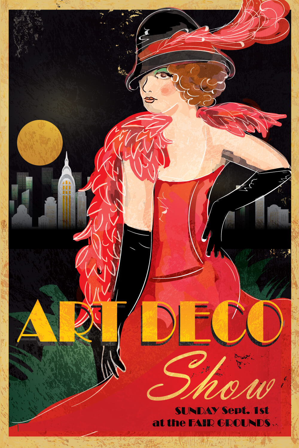
Image Source: iStock.com/JDawnInk
While this perhaps isn't so prevalent a style these days, like everything else, it may well come back around. So, knowing your way around the gradient tool may just help your artwork stand out from the crowd. Use gradients to help blend highly contrasting colors, or to create a softer effect than the bold colored blocks that populate most contemporary designs.
Because, remember - contrast doesn't always mean opposites, just difference. Big or small, it doesn't matter, so long as there's reason and intention there, and of course, you stick to the rules we laid out here. Consider every element in the ways we've listed, and you'll do great. And as always, experimentation is key. None of the artists who produced the work above got it right on the first try, and neither will you.
However, this article will probably let you get a lot closer than they did on their first go round.