Since the beginning of time, each individual birthed into this planet has undergone the assessment of comparability criteria. This assessment leads to his hierarchical categorization in the human pyramid, where several compartments outline the patterns of the social construct.
As awareness started sprouting a few decades ago, people have been pushing past social boundaries to get included in the streamlined division that regards all people as human beings. Inclusion, as in the name, has become the talk of the town. Take LGBTQ, women, minorities, and especially the disabled community, each is striving to get accepted by the society. And they have been making their place.
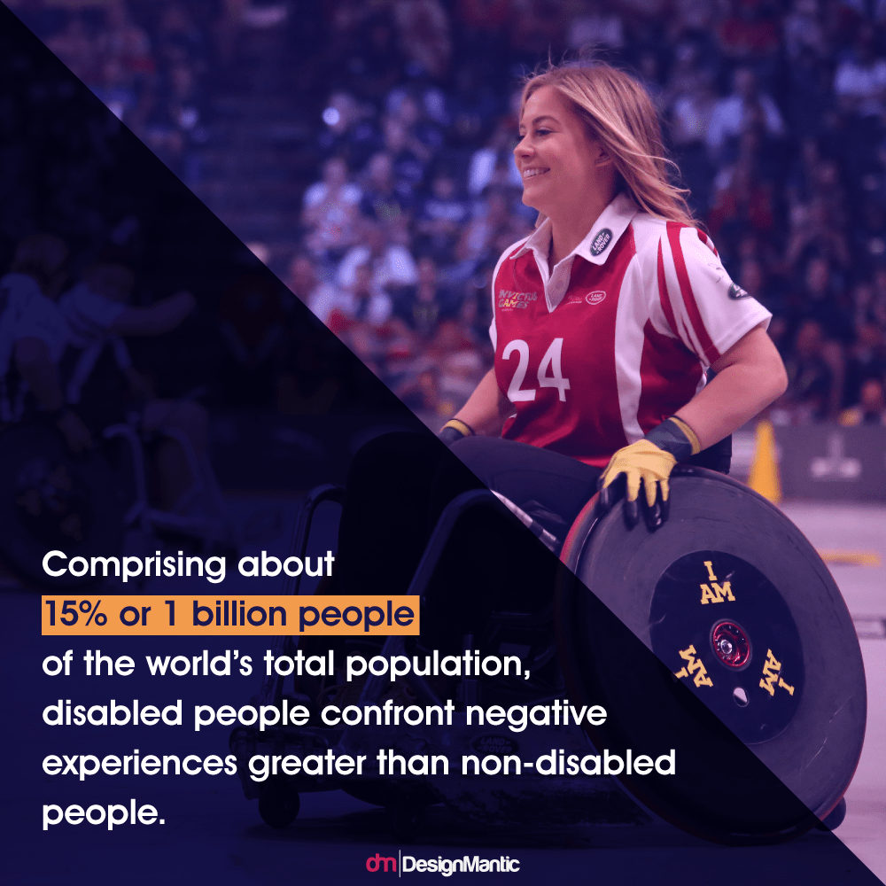
Their inability to fit the 'ideal' body norms leaves them behind in the race of life. However, efforts have been made to address the needs of the disabled people in every field, especially the graphic design industry.
According to In the research article, responding to the design needs of disabled people Rob Imrie pointed out the unanswered need of design structures for the disabled residing in the urban community. According to Imrie, the design of public buildings and transportation excludes the physical and spatial needs of the disabled people. This, however, represents neglect on the part of the individuals responsible for the production of environmental designs.
It isn't only the concrete jungles that fail to respond to the needs of the disabled; it’s the unavailability of accessible graphic design. As many people fall victim to disabilities day after day, Cornish and colleagues Cornish and colleagues revealed that visual accessibility lacks proper consideration when it comes to graphic design. Their study included a survey of 122 graphic designers and their clients, which disclosed a lack of communication and the buildup misunderstanding creating barriers in the visual accessibility .This, in turn, negatively impacts the inclusion criteria set out for designers.
In congruence with this article, Timothy Cox published a thesis where he discussed the neglected needs of the disabled community. Though the Americans with Disabilities Act Americans with Disabilities Act (ADA) – formed in 1990 – was a voice against ableism in various parts of life, 10 % of the disabled population did not see themselves represented in graphic design industry. As reported by Cox, an ongoing research by the DisABILITY organization showed the disabled not being made part of the design due to the lack of consideration by marketing companies.
These factors, however, bring out the visual disparity which lies in between the designers and the disabled people and hence, design for disability remains an unanswered call.
As the term accessibility has been mentioned before, one must wonder what it actually means. In the context of design, accessibility responds to the users’ needs to use and interact with a design It should be accessible to all, irrespective of the individual’s personal, cultural, physical, and socioeconomic status. In the web context, disabled people can understand, perceive, control, and interact with web elements. It tends to improve usability and inclusiveness altogether.
Accessibility overlaps with the concept of Universal Design. Ron Mace the creator of the term ‘Universal Design’, was a handicapped architect who advocated accessibility in every aspect of design.
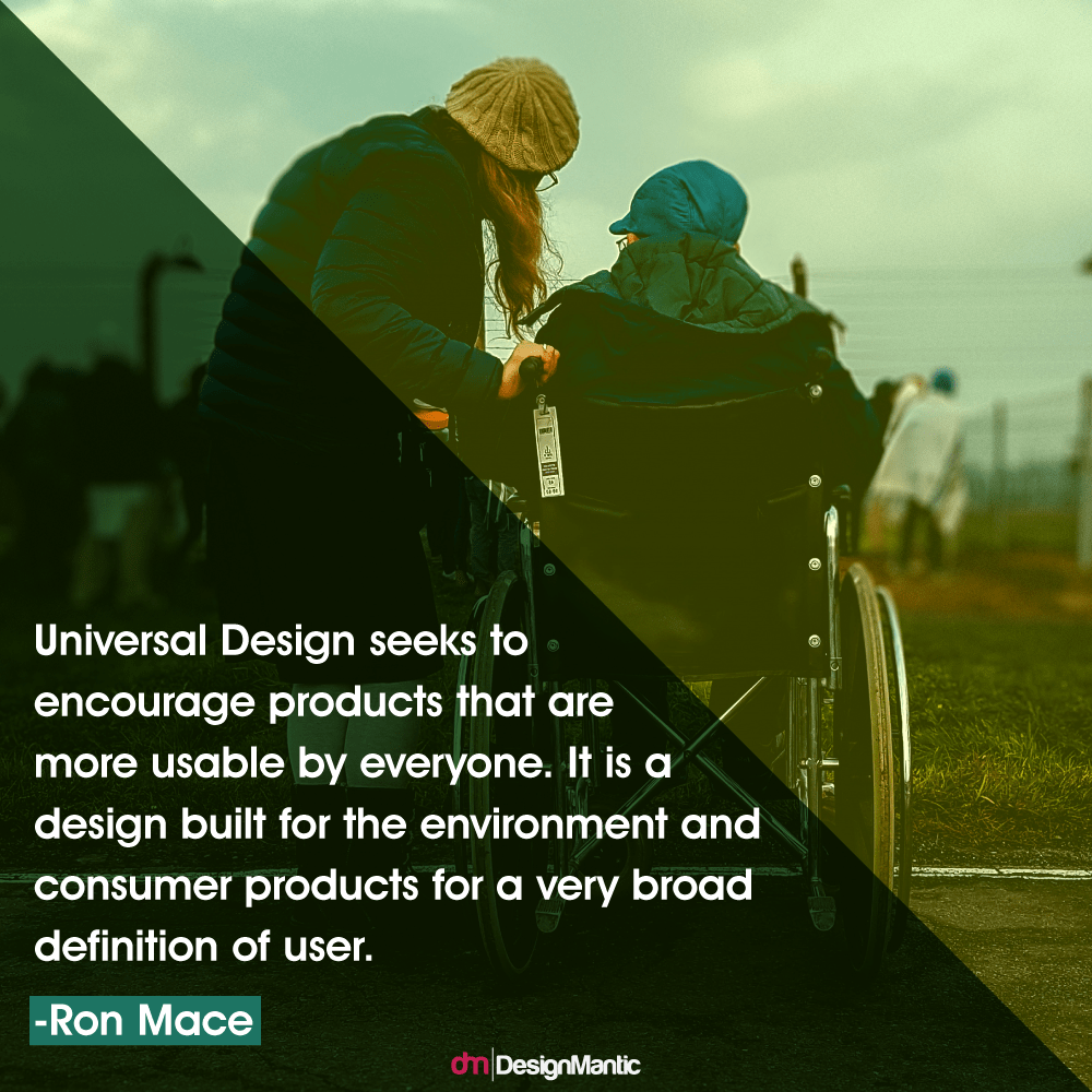
The universal design (aka the design for all or the inclusive design) is a comprehensive term that addresses the needs of every individual when it comes to accessibility. The universal access allows the non-impaired as well as impaired individuals to respond to the design equally. Accessibility deals with the concept of usability, while universal design is more of a user-oriented term. However, it is more important to consider the designing requirements of the disabled people.
The design must be inclusive, accessible, informative, and flexible for every user. However, the designers must consider the following areas of disabilities when designing for accessibility:
Visual:The most common forms of disability that hinders accessibility arise due to problems in visual communication .Any sort of visual impairment, such as reduced or limited eyesight, color blindness, and blindness, must be considered while designing
Mobility:The use of arms and legs can come as an issue for the handicapped and the physically impaired. They might have problems accessing the web and even some keyboard and mouse features.
Auditory:The distortion of auditory abilities in an individual can vary to certain degrees and range up to total deafness.
Cognitive:The term cognitive doesn’t portray the below-average users, but points out the issues when it comes to accessing the design, whether print or online. Problems associated with visualizing the design at hand and short-term memory issues position the disabled in this category. The disabled can also suffer from neurocognitive disabilities, including seizures, dyslexia, and sensitivity to light etc.
Since a design is only useful when it’s easily accessible, design accessibility is often associated with disabled people. You may take an example of a healthy construction worker, who became handicapped in a worksite accident. For a moment, one can fall from an ‘able-bodied’ status to a ‘disabled’ status. Mobility becomes a task impossible and one is plunged into the darkness to never walk again. That is why, designers need to follow certain codes and guidelines of accessibility for all, especially when it comes to designing for disabled people.
• Americans with Disabilities Act (ADA)
The United States Department of Labor (DOL) describes the Americans with Disabilities Act (ADA) as the law catered solely for the disabled population. It covers every aspect of their lives i.e. legal rights, transportation, job accommodation, employee rights, self-employment, and so on. The DOL assists the disabled via publications and other technical roles, thereby integrating law requirements.
• Accessible Icon Project
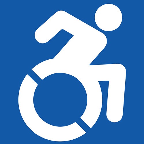
Apart from the governmental initiatives to include the disabled as the part of the overall community, design activism is also on the rise. When you walk past a street sign, you must’ve seen a specific symbol representing the disabled: man on a wheelchair. This graphic icon belongs to the Accessible Icon Project , as shown in the figure below.
The Accessible Icon Project offers its services for people with disabilities and collaborates with them to make the world an accessible place for all. The icon started thriving as a street art campaign that included stickers and graffiti. But this project needed a more professional touch and collaboration of disability advocates from across the US. As the foundation of a building is laid by a single brick, the Accessibility Icon Project soon gained recognition after several years of continuous efforts and partnered with a pro graphic designer, Tim Ferguson Sauder, to give the usual icon a professional touch. Moreover, partnering with a popular organization, the Triangle, Inc ., the Accessibility Icon Project has gained recognition worldwide and their graphic icon has earned a respectable status after all.
• World Wide Web Consortium (W3C)
The World Wide Web is also a disability-focused international community that focuses on web accessibility for all. It operates under a specific set of Codes of Ethics and , which allows promotion of professional practice with highest standards. Furthermore, its collaboration and partnering with FIDO has achieved a grand milestone in bringing simple yet authenticated web use among the users worldwide.
W3C’s statement of Intent goes as:
"W3C is committed to maintain a positive work environment. This commitment calls for a workplace where participants at all levels behave according to the rules of the following code. A foundational concept of this code is that we all share responsibility for our work environment."
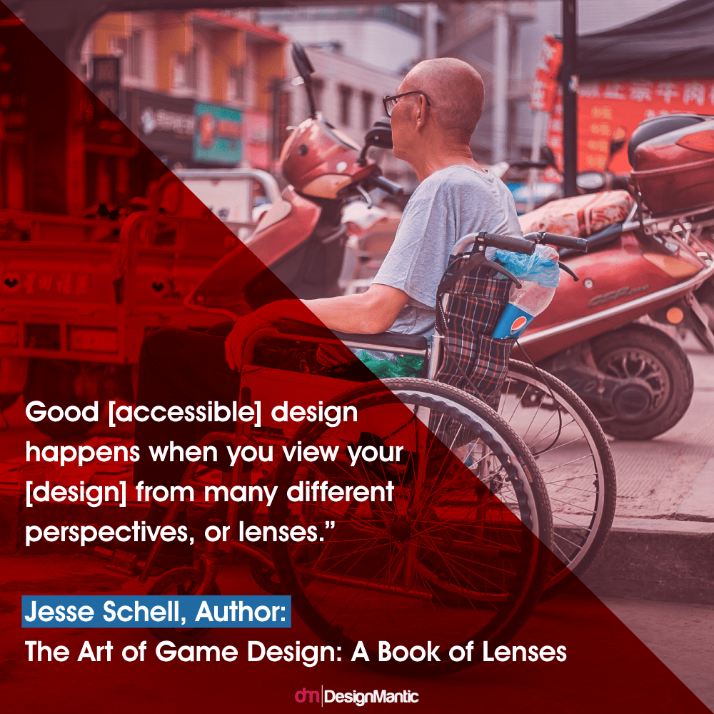
In the field of graphic design, designers are often hovered with several issues related to accessibility. How can they create a design that returns the call of every user? How can they make sure their design is perceived affirmatively by all? These questions and similar ones can be answered if only designers look for the ‘invisibles’ aka the disabled community through the lens of accessibility and graphic design.
Looking through the eyepiece of accessible design might help the designers understand the basic needs for inclusive designs as well the process of design itself. Not only the design becomes accessible, it also delivers better experience to the user of every kind, including the disabled. Every designer must consider the lens of:
What else should a designer know about accessibility? In case you didn't know, if a design is inaccessible, it becomes more of a trouble than an aid for the users, especially the disabled ones. There are a few things to remember when one is designing, keeping in view the 'invisibles'.
1. Innovation Speaks for Accessibility: When designing for accessibility, keep in mind the contrast guidelines barriers that will come along your way in the quest for innovation. You may produce as many designs as you like, but each of your attempt will give you an opportunity to come up with a new perspective. This way, the barriers you confront are actually your way to a more accessible design. Encapsulating every kind of user, beyond any discrimination can be a task impossible, but they offer the best of challenges.
2. Colors Aren't the Only Means of Visual Communication: This point comes as a savior for people who are suffering from visual deformities or visual constraints. A designer must make sure that he uses colors to highlight the information that is already visible. Even if you’re using colors, make sure you use any other means to elaborate why that field was highlighted. You can also make use of broad borders, text (bold/italic), underlines, and so many other tool choices than using color alone.
Related: 10 Commandments of Color Theory
3. Understand Text and Background Contrast: When creating designs for accessibility, a designer must keep in mind the developed by the W3C. For larger text and images with larger text, the contrast ratio should be 3:1. You can also find some tools for color palettes, via which you can test colors for accessibility. Designers can also use high-contrast to enhance visibility.
4. Labels and Borders are More Than Important: As the fad to keep everything less, simple, and minimalistic is escalating these days, the designers are forgetting the main attributes of forms, including border lines and visible labels. For instance, without a boundary, a person with a defective vision can possibly miss it out the text box. Moreover, individuals with cognitive and mobility problems can face issues related to the undefined boundaries and lack of clear labels.
As time goes by, responding to the needs of the disabled people is becoming a priority. We must all move at the same pace if we need to progress forward. The illusionary hyperbole of disability and accessibility need to shatter and a new, broad vision needs to arise that allows creativity to flourish across all mediums and platforms.
Designs must be universal and must respond to the scattered needs of the disabled. Designers and disabled, all are human. Both can contribute to make a world a better place for themselves and others. Thus, design and disabled must go hand in hand.
Here's a chuck of inspiration from the world of design, disability, and accessibility. Your enthusiasm and willingness is all that counts to make the invisibles visible again.